How to Create High-Converting Landing Pages (with Examples)
Having a compelling landing page is no longer a nice-to-have for your campaign—it's a necessiry part of your of your holistic lead generation strategy. A well-designed and optimized landing page can significantly increase conversions for your pay-per-click (PPC) or email marketing campaigns, leading to higher ROI.
But how can you build a landing page that turns casual browsers into your committed customers?
Here's all you need to know about landing pages—from creation to optimization, and even some dazzling design examples to inspire you.
- What is a Landing Page?
- How Landing Pages Impact Performance
- Building a High-Converting Landing Page
- Landing Page Design Tips for Conversion
- How to Optimize Your Landing Pages
- Effective Landing Page Examples
- FAQs on Landing Pages
What is a Landing Page?
In simple terms, a landing page is a standalone web page where a visitor 'lands' after clicking a link from an email, an ad, or similar web places. Unlike regular web pages, which often have multiple objectives and encourage exploration, landing pages are designed with a single, laser-focused goal—known as a call-to-action (CTA).
Do you need a landing page if you already have a website?
A landing page differs from a traditional website—they serve different purposes and are used strategically based on your objectives:
- A lead generation website is a comprehensive platform that contains multiple pages with various information about your business, including product descriptions, company history, blog content, and contact information. Websites are designed for exploration, with users clicking through multiple pages to learn more about you.
- On the other hand, a landing page is a single, standalone page with one primary objective: to convert visitors into leads or customers. It's a focused and streamlined page that directs users towards a specific CTA, such as filling out a form, purchasing a product, or signing up for a newsletter.
While a website encourages visitors to explore and learn more about your business, a landing page minimizes distractions and guides visitors towards a singular action, maximizing the chances of conversion. Both are valuable tools in your digital marketing arsenal, and you should be using both for their intended purposes.
What's a "thank you" page?
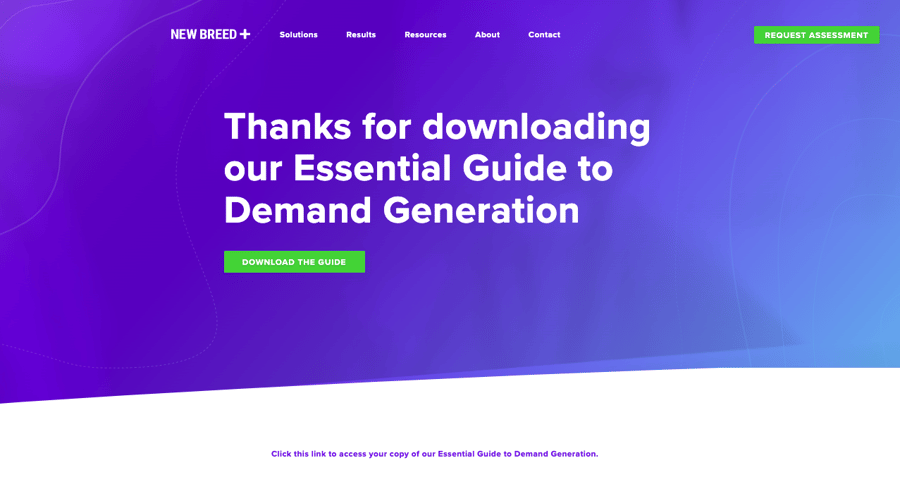
A thank you page is an essential part of your landing page strategy. It's where you express appreciation to your visitors and continue engaging with them after they've completed the desired action. Thank you pages are the next step after a visitor clicks the CTA. Here's a quick check list for what to include in a TYP:
- Confirmation and Next Steps: Confirm the successful completion of the action and provide clear instructions for the next steps. Whether it's a form submission, a purchase, or accessing a resource, make the information concise, easy to understand, and visually prominent.
- Continued Engagement: Use the thank you page as an opportunity to keep engaging with your visitors. Include additional resources like related content, blog articles, or social media links to encourage further exploration and deepen the relationship.
- Upsell or Cross-Sell Opportunities: Depending on the action taken, you can strategically present upsell or cross-sell offers on the thank you page. Suggest complementary products or accessories to increase the chances of further conversion and revenue generation.
How Landing Pages Impact Performance
Landing pages are not just about turning visitors into customers—they're about creating a connection. Their potential extends far beyond conversions, offering significant value in building relationships, fostering engagement, and learning about your audience.

Better Conversions
Of course, landing pages are designed with conversions at their core. They serve a single purpose and all elements on the page align to steer visitors towards this goal. The concentrated focus and minimal distractions on a landing page can lead to higher conversion rates compared to standard web pages.
While the average landing page conversion rate for all industries is 9.7%, a good benchmark to strive for is a conversion rate of 10% or higher.
Improved Ad Performance
But it doesn't stop there. Landing pages can also amplify the impact of your advertising campaigns. By crafting a seamless and engaging experience that aligns with your ad content, you can elevate your Quality Score in Google Ads and lower your cost-per-click. The result is an efficient use of your advertising budget and increased return on your investment.
Simplifying the Customer Journey
A well-crafted landing page doesn't just aim for immediate conversion—it also simplifies the customer journey. By focusing on one specific action, landing pages help reduce decision fatigue. They don't have to navigate through a complex website or sift through loads of information to find what they need.
Instead, they're presented with a clear path that leads them straight to the desired action. This streamlined journey can enhance the user experience, increase satisfaction, and foster a positive association with your brand.
Capturing Leads
At the end of th day, landing pages play a crucial role in lead generation. By offering valuable resources, like a guide, free trial, or industry report, in exchange for contact information, landing pages can capture leads more effectively than other types of web pages. The information gathered is a powerful asset for your future marketing efforts, helping you to foster and personalize the relationship with high-quality prospects that fit your ICP.
Building a High-Converting Landing Page
Creating a landing page isn't just about putting together a pretty page—it's about crafting a compelling experience that inspires action.
How to approach the landing page creation process
- Defining Your Objective: Every landing page starts with a clear objective. What do you want visitors to do? Whether it's signing up for a webinar, downloading an eBook, or purchasing a product, this objective will drive every decision you make.
- Identifying Your Audience: Understanding your audience is crucial in creating a landing page that resonates. Think about their needs, their pain points, and how your offer provides a solution. This understanding will inform your messaging, UX design, and overall strategy.
- Crafting the Right Content: Content is the meat of your landing page—it's what convinces visitors that your offer is worth pursuing. Your headline should be compelling and clear, quickly communicating the value of your offer. The body content should further elaborate on this value, using persuasive copy to highlight the benefits. Include key information using bullet points for easy readability.
- Designing a CTA: Your CTA is arguably the most important element on your landing page. It's the action you want visitors to take. Ensure it stands out visually and that the copy is action-oriented, conveying urgency and value.
- Building Trust: Social proof, such as testimonials, customer logos, and case studies, can significantly enhance the credibility of your offer, building trust with your visitors.
Remember, creating a high-converting landing page is a science and an art. It's about combining persuasive content with strategic design, all while keeping your target audience at the heart of your decisions.

How to write engaging copy for a landing page
Writing compelling and persuasive copy is crucial for the success of your landing page. It's not just about presenting information—it's about engaging your audience and convincing them to take action. Here are some effective copywriting techniques to consider:
- Attention-Grabbing Headlines: Start with a captivating headline that immediately grabs your visitors' attention. Make it clear, concise, and aligned with your value proposition. Use powerful words and phrases that evoke curiosity or urgency.
- Clear and Concise Messaging: Keep your messaging simple and easy to understand. Clearly communicate the benefits and value of your offer. Use concise language to maintain readability, around 8th grade readability level. Avoid jargon or complex language that may confuse or alienate your audience.
- Customer-Centric Language: Speak directly to your audience using the second-person perspective (you/your). Focus on addressing their needs, pain points, and desires. Use language that resonates with them and makes them feel understood.
- Persuasive Storytelling: Tell a compelling story that connects with your audience on an emotional level. Use storytelling techniques to illustrate how your offer can solve their problems or improve their lives. Paint a vivid picture of the transformation or benefits they can experience.
- CTA Copy: Your CTA should be action-oriented, clear, and persuasive. Use strong verbs and phrases that encourage immediate action. Highlight the value or benefit visitors will receive by taking the desired action.
Where to find landing page templates and tools
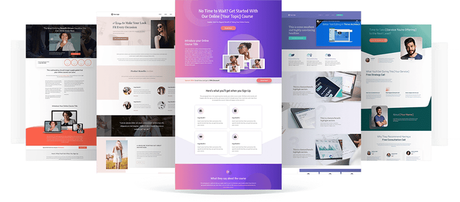
Designing and building a landing page from scratch can be a time-consuming task. Luckily, there are various tools, templates, and checklists available that can simplify the process and help you create high-converting landing pages quickly. Some of these tools go as far as being industry-specific, so be sure to browse available resources before pulling up your sleeves to build a landing page from scratch.
- Landing Page Builders: Platforms like Unbounce, Leadpages, and Instapage offer drag-and-drop functionality and pre-designed templates, making it easy to create a top-notch landing page.
- Content Management Systems (CMS): CMS platforms such as WordPress, Squarespace, and Wix provide landing page templates and plugins that simplify the design and optimization process.
- HubSpot CMS: HubSpot CMS is part of a comprehensive marketing and sales Hubs with a powerful landing page builder, providing a range of customizable templates and integration with other ecosystem tools.
- Template Marketplaces: Marketplaces like ThemeForest and TemplateMonster offer a variety of professionally designed landing page templates that can be customized to match your brand.
Consider your technical expertise, customization needs, and budget when choosing a tool or template.
Landing Page Design Tips
Landing page design isn't just about aesthetics—it's a vital part of your conversion strategy. Every element on your landing page should, yes, follow your brand guidelines and serve a purpose, driving visitors towards your desired action. Let's explore some key design elements that can boost the conversion potential of your landing page.
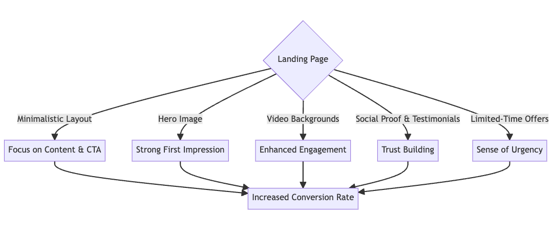
When in doubt, go with a minimalistic layout.
Simplicity can be a breath of fresh air. Minimalistic design and colors eliminate unnecessary clutter and distractions, allowing your visitors to focus on what truly matters—your content and CTA. This design ethos embraces functionality, using only essential elements like a compelling headline, a few strategic bullet points, and a standout CTA.
Make a strong first impression with a hero image.
A picture is worth a thousand words—especially in web design. A hero image is a large, prominent banner image, typically located front and center on your landing page. It's one of the first elements that your visitors see, making it a crucial part of their first impression. A captivating hero image that aligns with your message can instantly draw in your visitors, piquing their curiosity to learn more.
Try incorporating video backgrounds.
If a picture is worth a thousand words, then a video could be worth a million. Video backgrounds add a dynamic, engaging layer to your landing page. The video subtly plays in the background, adding depth and interest without overwhelming your visitors. Videos can be a powerful storytelling tool, helping to convey your message in a more immersive and emotional way.
Build trust with social proof and testimonials.
When it comes to landing pages, and demand generation in general, trust is key. Including elements of social proof can significantly increase the credibility of your offer. This could be in the form of testimonials, reviews, or logos of brands you've worked with. These elements show your visitors that others have trusted you and were happy with the result, making them more likely to do the same.
Create a sense of urgency with limited-time offers.
Creating a sense of urgency can spur your visitors into action. This could be done by showcasing a limited-time offer or a countdown timer on your landing page. The fear of missing out can be a powerful motivator, making visitors more likely to take immediate action.
Remember, while these design elements can improve performance, the most important thing is to keep your audience in mind. Always design with the preferences and needs of your target audience at the forefront. Test different designs and elements to see what resonates most with your audience and brings you the highest conversions.
How to Optimize Your Landing Pages
Once your landing page is live, the work doesn't stop there. Conversion rate optimization (CRO) is a continuous process that involves fine-tuning your page based on data, user feedback, and industry best practices. First, consider common KPIs that will help you gain insights into visitor behavior, identify areas for improvement, and make data-driven decisions:
- Conversion Rate: Calculate the percentage of visitors who complete the desired action, such as form submissions or purchases.
- Bounce Rate: A high bounce rate may indicate issues with messaging, design, or overall user experience.
- Time on Page: Analyze this metric to understand if visitors are consuming your content thoroughly or skimming through it.
- Click-Through Rate (CTR): If your landing page includes links or buttons to other pages or resources, track the CTR to determine how effective those elements are in generating further engagement.
- Heatmaps and Scrollmaps: Visualize visitor behavior on your landing page, by using tools that show you where visitors click, how far they scroll, and which areas of the page receive the most attention.
Now, we're on to some key areas to focus on when optimizing your landing pages.
Create consistency between the ad and landing page.
Message match between your ad copy and the content on your landing page is crucial for performance. If your ad promises a free eBook, but the landing page offers a discount on a product, your visitors will be confused and likely bounce. Ensure that your ad copy and landing page content align perfectly to maintain coherence and fulfill user expectations.
Streamline user actions with a clear conversion path.
A well-optimized landing page should have a clear, frictionless path. This involves minimizing the number of steps a user needs to take to complete the desired action. For instance, if your goal is to collect leads, the form should be simple and straightforward, asking for only necessary information. Promotional strategies will also work well here, if you need to motivate your average visitor more than a usual BOFU.
Use A/B testing to refine landing page elements.
A/B testing, also known as split testing, is a valuable tool for landing page optimization. It involves creating two versions of your landing page with a single varying element (like the CTA color or headline copy), and seeing which one performs better. This kind of testing can provide invaluable insights into what works best for your audience.
Improve user experience with mobile and load speed optimization.
With a majority of users browsing on hand-held devices, mobile optimization is essential. Ensure your landing page is responsive, meaning it adjusts and displays correctly on any device. Load speed is also critical to user experience—a slow-loading page can increase bounce rate and negatively impact your conversions. Optimize your landing page's load speed by reducing image file sizes, minifying code, and leveraging browser caching.
Effective Landing Page Examples
Let's take inspiration from some high-performing landing pages that successfully drive engagement. Here's some examples to learn from!
New Breed's Top-Performing Landing Page
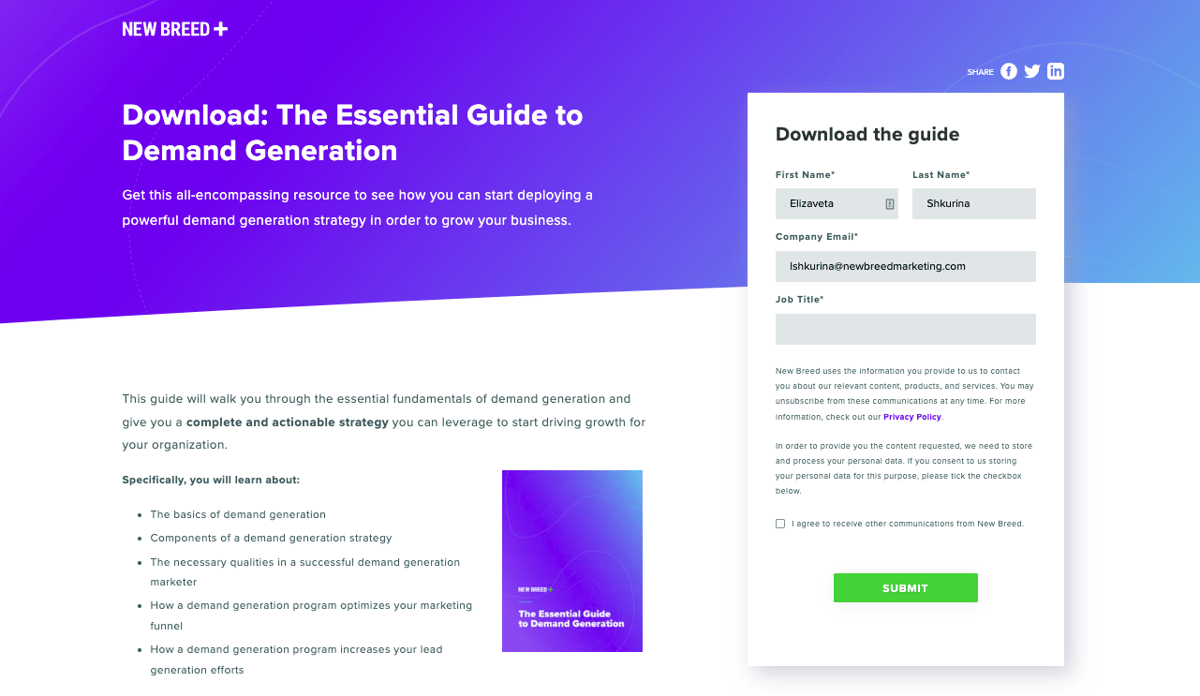
Not to toot our own horn, but our Guide to Demand Generation landing page is a remarkable example of conversion-driven, yet simple design. This landing page boasts an impressive 39.01% view-to-submission rate, well above the industry standard of 10%.
With a clear headline and a detailed breakdown of the guide's contents, this landing page make it easy for visitors to understand the value they'll receive. The strategically placed form above the fold ensures that taking action is just a few clicks away. Plus, removal of the main navigation above the fold minimizes distractions and keeps the focus on the offer.
Unique Features: Compelling headline, breakdown of guide contents, alignment with target persona, removal of main navigation above the fold.
Try This for Your Next Landing Page: Craft an attention-grabbing headline, provide a comprehensive breakdown or preview of your offer, and remove unnecessary navigation elements above the fold to increase visitor engagement and drive conversions.
HubSpot's Interactive Content Offer Landing Page
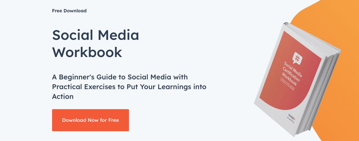
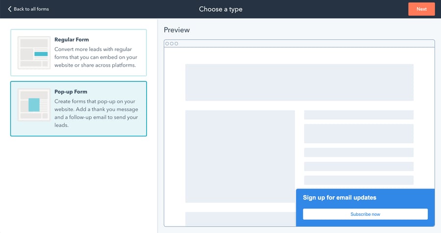
HubSpot promotion of their Social Media Workbook goes beyond the ordinary with its interactive design and user-friendly functionality. Take a sneak peek into the guide's valuable contents by clicking through the interactive preview. And when you're ready to take action, the form seamlessly pops up upon clicking the "Download Now" button, creating a smooth and engaging user experience.
Unique Features: Interactive guide preview, seamless form pop-up.
Try This for Your Next Landing Page: Engage visitors with an interactive preview of your offer, provide a seamless conversion experience with a well-timed form pop-up, and maintain a distraction-free design for maximum impact.
Cuberto's Minimalist-Yet-Effective Contact Us Page
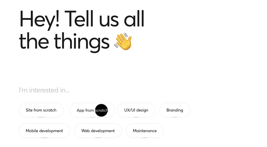
Cuberto's Contact Us Page is a testament to the power of minimalist design. Instead of traditional drop-down menus, the page features interactive buttons that the user can click to select their preferences. This interactive design not only adds a fun "get to know you" element but also enhances the overall engagement. By asking the user to share their interests without demanding too much effort, Cuberto personalizes the experience and tailors their services to the user's needs.
Unique Features: Captivating minimalist design, quiz-like format, prominent contact form.
Try This for Your Next Landing Page: Embrace the power of minimalist aesthetics, ensure your contact form takes center stage on a landing page where folks are ready for a BOFU intent like a "contact us," and personalize the user experience with social media links and location-based information.
The Takeaway
Landing pages are a potent tool in your digital marketing arsenal. Whether you're looking to boost conversion rates, foster engagement, or both, a well-designed and optimized landing page can help you achieve your goals. Remember to keep your content relevant, your CTA compelling, and your design engaging.
FAQs on Landing Pages
1. Can I have multiple CTAs on a landing page? Typically, it's best to focus on one primary CTA to avoid confusing your visitors. However, in some cases, a secondary CTA can be useful.
2. How often should I test my landing page? A/B testing should be an ongoing process as trends, and user behavior can change over time.
3. Is a minimalistic design always the best choice? Not necessarily. The design should match your brand and audience preferences. Some audiences may respond better to more elaborate designs.
4. How long should my landing page be? The length can vary based on your goal. Just ensure that it's long enough to provide all the necessary information, but concise enough to keep your audience's attention.
5. Can I SEO-optimize my landing page if it's primarily for paid traffic? While rare, because the short copy on a landing page is frequently competing with long-form content for the same keyword, an optimized landing page can attract organic traffic, which could lead to higher overall visibility and conversions. On-page optimization means using relevant keywords in your content, meta tags, URL, and image alt tags.
Elizaveta Shkurina
Sr Creative Strategist specializing in B2B brand creation, sales enablement, and SaaS demand generation. With 8 years of experience, she excels in driving ROI and revenue-driven KPIs through collaborative innovation.


