6 Outstanding Landing Page Examples

Landing pages are a critical element of your website, your marketing strategy and your lead generation. They are how you capture visitors' information once they click on search results, marketing promotions, advertisements or marketing emails.
Landing pages are sometimes also known as a lead capture page, a static page or a destination page.
You have a ton of choices when it comes to designing your landing pages for your site. The decision you make should be based on things like the industry you are in, the context of the page, the size of the form you are placing on the page and your brand.
To be honest, there is no one-size-fits-all landing page design that is always the “best” choice. But, there are a few different common types of landing pages that you should be aware of:
Standard Classic: The standard landing page has a form above the fold and a clear value proposition. These should be easy to understand and fulfills the visitor’s intent quickly and without friction.
Long-form: A long-form landing page offers more value on the page itself than the standard or classic landing page. While a classic landing page typically gates the offer or submission with a form and a very limited amount of text, a long-form landing page may offer a sneak peak of the asset or more contextual information. Recently, ungated content has been on the rise, and in this case, the entire offer or download could be offered on the page without submission of a form, and then there is usually a “get a copy of this asset” option to submit information.
Video: A video landing page is very similar to the standard classic, but instead of placing text for context next to the form, there’s a video explaining why you should download the offer or submit the form.
But, you don’t have to stick to just those styles, there is always room to be creative and innovate with the way you use landing pages to engage with prospects and show off your brand.
Here are six noteworthy landing page examples:
1. Slack
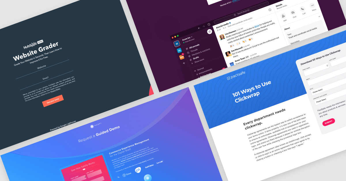
Slack’s landing page for downloading their platform pre-selects the right version of their software for you based on what type of system you are on. The page contains minimal text, making it frictionless and offers a clear call-to-action for the user.
If you’re viewing the page from a computer, the page also provides an opportunity for you to receive the Slack mobile app link by text so you can easily access their mobile product as well.
2. HubSpot
HubSpot as a brand does some really cool and experimental things with tools and interactive pages on their site. Ironically, we’ve chosen this page for its simplicity — sometimes the simplest answer is the best answer. The form is short, sweet and integrates well on the page with a bit of the HubSpot brand and color.
The tool that the page is created for lends itself to a shorter form because it’s a website grader, which means the most important piece of information to collect is a visitor’s site URL. Rather than bogging the user down with forms and text, they kept it easy to ensure a visitor has limited friction and takes the action intended on the page.
3. Wistia
This landing page from Wistia has quite a few elements that have landed it on our list.
First, they use a video on their page above the fold. A video is a great way to provide extra context and may boost engagement on a landing page.
What’s really interesting about this page is that the offer itself actually is on the page for free. It’s ungated so you don’t even have to submit the form to see it. However, the actual guide copy is located beneath the fold, and the button at the top that says “download the guide” will deliver you a PDF version to your inbox for future reading offline.
While ungated content or “free” content isn’t everyone's jam, it just goes to show that you can get creative and try out new things on your landing pages. What works for someone else may not work for you. You may find going against what is constituted as best practices suits your brand and actually gets you more conversions or higher engagement.
4. Salsify
This page from Salsify does a great job aligning the visitors’ intent with the content on the page. The page’s goal is to have visitors submit their information to receive a product demo. However, users may be hesitant to submit the form because there are quite a few required pieces of information.
To combat that friction, Salsify has placed a carousel bar of brands they have worked with to act as social proof for users on the page. They also have two strong stats beneath the carousel to help establish trust with visitors in order to encourage form submissions.
Regardless of what the landing page you are creating is for, it is imperative that you align the form or offer with the real reason users are there and what they need or want at that moment of interaction.
5. Vidyard
While the most commonly thought of landing page type is often a download or piece of content, a company’s contact us page is also a great place to use design to improve user experience.
One of the most common places for friction on a contact us page is often a large drop-down form with tons of different options for the user to select. This happens because companies often have visitors on their contact us page for a ton of different reasons and want to be able to segment submissions accordingly.
Vidyard solves for this challenge by offering a tab system for users to select what their primary reason for submitting the form is: questions, pricing, demo or API. This helps change the page to show only the information the user needs, while still letting Vidyard get the right questions answered from visitors in order to serve them best.
Not only is this page functional, but it also is clean and sleek — which is always a bonus in our book.
6. PactSafe

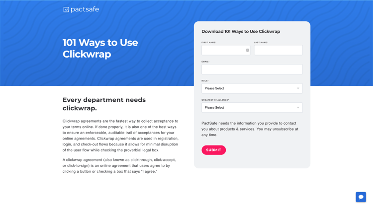
This 101 Ways to Use Clickwrap download from PactSafe may look like your average landing page with the form and text above the fold. But when you continue to scroll down the page you will find quite a bit of contextual information about the offer and the subject at hand.
If a user isn’t quite convinced by the information at the top of the page, they will be pleased to find there is much more context offered further down. But, including all of the copy under the fold doesn't distract the visitor from the form or add any friction for users who are in fact ready to submit and download.
The Takeaway
As marketers, we sometimes feel the need to follow best practices or do what everyone else has done because we were told it works best. But, you know your brand, your solution and your audience best.
Landing pages are a huge component of your lead generation and marketing strategy, so experiment with different types of landing pages on your site and see which ones work best.
Weslee Clyde
Weslee Clyde is an inbound marketing strategist at New Breed. She is focused on generating results using inbound methods and is driven by the customer experience. When not at the office, you can find her binging a docu-series on true crime or perfecting her gluten-free baking skills.


