Calls-to-Action (CTAs) are an essential element of any successful inbound marketing strategy. A Call-to-Action is a visualization meant to compel a user to take a desired action. A CTA can be effectively utilized across all marketing channels to drive conversion.
Before creating your CTA, it is critical that you determine your conversion goal. The way you structure your CTA and its respective content should work to persuade prospects to take this action. Do you want them to download a premium content offer? Register for a webinar? View a blog post? Whatever it is, make sure you have it narrowed down before you begin crafting your CTA.
By adhering to the following CTA best practices, you can fuel your lead generation strategy across marketing channels, and, in turn, drive growth for your business.
Actionable Language

When creating your CTA, it is important to incorporate compelling language. After all, the whole point of your CTA is to call a user to take an action. Use actionable verbs in your CTA copy to drive conversion.
For example, the CTA “Get a Free Assessment” uses the informal verb “get” rather than the standard, run-of-the-mill phrase “request.” While this change seems trivial, utilizing a phrase with more personality like “Get the Free Assessment” can be more compelling than the standard “Request Assessment.” Additionally, utilizing the word “free” enhances the value proposition of your offer. This simple nuance could potentially make all the difference to a prospect deciding whether or not to convert on your offer.
Consider Font, Color and Style

As with any visual asset on your website, it is important to make sure that your CTAs not only align with your branding and style, but are visually engaging as well. User experience plays a critical role in your conversion rate, so be sure to create your CTAs with the psychology of design in mind. A CTA that uses an engaging font and actionable language in combination with the right elements of design can make all the difference to a decisive prospect.
Effective Placement

When it comes to CTAs, it’s not all about looks. Placement is a crucial factor that could potentially make or break a prospect’s decision to convert. Place your CTAs where they are visible and within a relevant context to promote click-throughs.
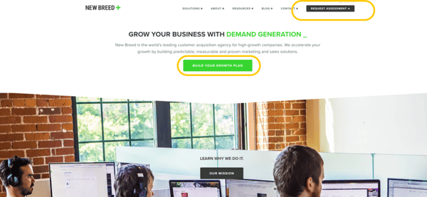
In the example above, two CTAs are visible above the fold of New Breed’s home page, both placed in relevant contexts.
Your website’s navigation bar is an optimal place for a Bottom-of-Funnel (BOFU) CTA, especially if your navigation is “sticky.” By placing a BOFU conversion point in the navigation, you will give users an immediate opportunity to convert at any point on your website.
Additionally, you could place a CTA anywhere that describes a product or service that could be associated with a relevant CTA. For example, the module describing what New Breed does for its clients provides a CTA labeled “Build Your Growth Plan,” inviting users to learn more. By providing an opportunity for users to dive deeper into your initial description, you can promote conversion and drive lead generation.
Concise Communication

When it comes to CTAs, the more explicit the better. Don’t give users the opportunity to second-guess the value of your offer by being clear and direct with your CTA.
For example, a button that says “Download Now” may be unclear to a prospect without the proper context. Conversely, a CTA labeled “Download the White Paper” is self-explanatory and requires almost no other context, aside from subject matter. Your prospects are busy people, so the less guesswork they have to conduct, the more likely they are to convert on your offer.
Smart Content

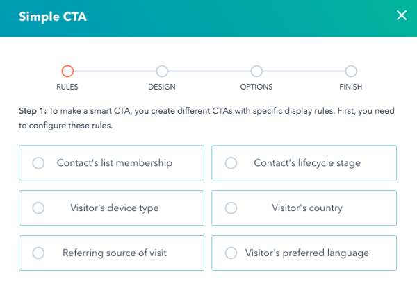
If you’re a HubSpot user, we highly recommend capitalizing on the value of Smart CTAs. With HubSpot’s Smart CTA feature, you can serve a user a specific CTA based on any of the following criteria: list membership, device type, referral source, lifecycle stage, country, and preferred language. This feature enables marketers to easily serve personalized, relevant content with just a few clicks, eliminating the need to create multiple variations of the same marketing content. It’s no secret that personalized content can do wonders for your conversion rates, so try to incorporate Smart CTAs wherever possible.
Create your CTA strategy with these best practices in mind to drive conversion and grow your business. Download our free e-book “10 Steps to Redesigning Your Website” to learn more about effective inbound web strategy.


