6 Ways to Use Your B2B Website Navigation More Effectively
Navigation is one of the most important things about your company’s website. It needs to be clean, easy to understand and intuitive to the user. Visitors should be able to move through your site effortlessly.
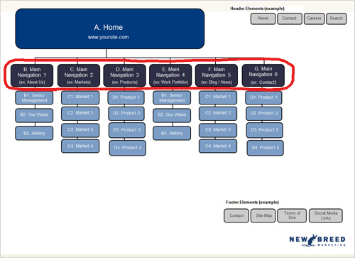
However, what many companies don’t realize is the importance their top level navigation pages play in this process, and ultimately in the success of their B2B website. Those pages can do more than just serve as place holders for subpages.
Here are six ways you can use your B2B website navigation more effectively:

1. Usability
When users arrive at your site, they expect to be able to click on the top navigation menu. It’s actionable and allows for more engagement. If your navigation element is just a hover state, with a drop down menu of the pages in that section, you miss out on the opportunity to make the top level element an actual page.
2. Table of Contents / Index
It may be the case that a user lands on your website and isn’t overly familiar with all of your offerings. We most commonly use sub-navigation pages to house more detailed or targeted information, but we need to be conscious that the user may want to learn more about your company but may not understand the intricacies of your offerings (or sub-pages). Your top level pages provide the perfect place to contain general information about the section and allow you to provide excerpts for your subpages, letting users choose to learn more on a specific topic. In addition, if your B2B website was created with a CMS (Content Management System) there are methods to dynamically show the table of contents and even excerpts for a particular sections top level page.
3. Search Engine Optimization (SEO)
Having an additional page of relevant, keyword optimized content can really boost your SEO. Make sure that the content on this page speaks to the sub-pages of the section and not only contains industry terms and words you rank on now but also that it gives the user a sense of what to expect if they dive deeper into this section of your site.
4. Paid Search Campaigns
While the subpages in a given section are excellent for very targeted paid search terms, sometimes it’s nice to have a mixture of general and specific terms when running a paid search campaign. Given their nature, top level pages work well when using more general search terms or when you know what section your potential client is interested in but not the exact product or offering.
5. Landing Page Usage
A great way to leverage these higher level pages is to use them like you would a landing page. Add a call-to-action, add a capture form and integrate it with a preexisting campaign or create a new campaign around the content in this section of your site. The beauty is you can change up the way you use it depending on what’s running at a specific time. Think of this page as something that can be fluid and ever evolving.
6. Branding
Last, but definitely not least as this is an extremely important point, your top level navigation pages are huge branding opportunities for your company. These pages often allow for large headers and graphics since they aren’t as heavy on text, which not only can be graphically compelling but also provide consistency across your site and relay certain concepts even better than plain text.
Christopher Mathieu
Christopher Mathieu is the Chief Services Officer at New Breed, an Elite HubSpot Partner based in Burlington, VT, which helps customers implement the right technology and strategies to unlock meaningful growth. With a background in design, technology, and demand generation, his over two decades of experience allow...


