Design. Language. Character. These are the tools that smart brands use to stand out from the crowd. Bringing these tools into a central document called a brand style guide allows companies to tell a powerful story about who they are and where they’re headed.
Style guides ensure brand consistency across a wide variety of media platforms. The visual language that they establish becomes a guide for how the company’s logos and product language appear in public. Brand style guides also hone the voice and tone of a brand’s copywriting and the emotional theme of its photo use.
See how five companies brought these elements (and more) together to create beautiful, instructional style guides.
Spotify

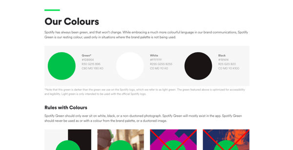
Spotify delivers a stunning digital experience for its users. Their guide is focused on graphic design best practices and does a great job of outlining use cases for its assets. Spotify’s seamless UX depends on their unique design language and has been key to their market dominance.
Strengths:
- Specificity: Spotify’s brand style guide provides perfect examples of how not to use their iconography. It outlines color matching problems, logo manipulation and sizing restrictions — all rules that help to create consistency across Spotify's user-facing content. 3rd party developers depend on guides like this when designing material that depicts the Spotify brand.
- Openness: Spotify knows that their branding is used by people who don’t work for them and uses this guide to create boundaries around the depiction of their assets. To guarantee consistency, their style guide offers downloadable files of their various logos and logomarks.
Macaroni Grill
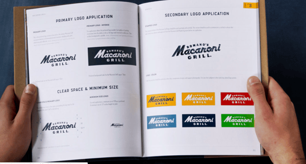
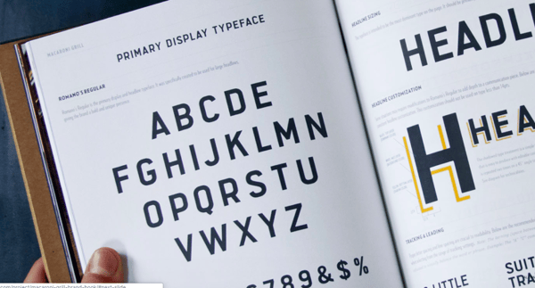
Macaroni Grill developed a beautiful, hands-on brand style guide. The delivery of their guide aligns with their industry , where good aura and strong sensory experiences define success. The design details are high-level and their messaging is spelled out clearly from end to end.
Strengths:
- Photography: The guide homes in on their photography goals with incredible detail. They give a lot of thought to textures and outline specific use cases for photo styles across their menus, ads and website.
- Format: Most brand style guides are only accessible digitally. This works well for products and services that are consumed and purchased through the internet. Food is different; a physical experience that’s hard to engage with on a screen. While print book sales continue to decline, ethnic cookbook sales rise 73% year over year, and this guide fits the mold perfectly.
Cisco

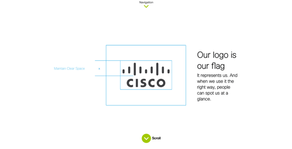
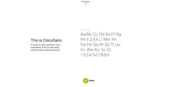
Cisco’s brand style guide is as widespread as their product offerings. It transcends a design guideline — it’s a platform for their mission, culture and company value proposition.
Strengths:
- Interactivity: Cisco has a powerful UX baked into their style guide. The scroll-down format makes the guide digestible and light-hearted. Transitions within the guide are dynamic, and font details are memorable thanks to modules that allow you to try their typeface directly on the screen. A downloadable checklist is attached to make their guide more accessible and adaptable for internal and third-party use.
- Breadth: In addition to its design outline, Cisco’s style guide includes a brief goal & strategy section. This section dives deep into their value proposition and creates a structure for the design decisions they outline throughout the guide. Because Cisco is a communications technology company, their guide has sample audio and video assets.
Alienware

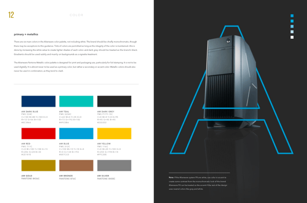
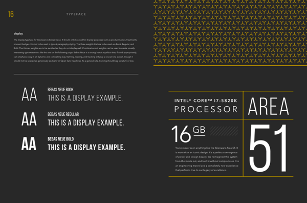
Alienware computers are elite among serious gamers. Their brand style guide reinforces a high-tech public face that takes performance seriously.
Strengths:
- Graphic Design: The do’s and don’ts laid out in this guide leave no stone unturned. Everything from fonts and vector details to photography and layouts are explicitly defined in Alienware’s guide; an unsurprising feature of a such a refined hardware company.
Brand style guides play a particularly important role in consumer and hardware products, as they lay the foundation for packaging and in-store experiences.
New York City Transit Authority
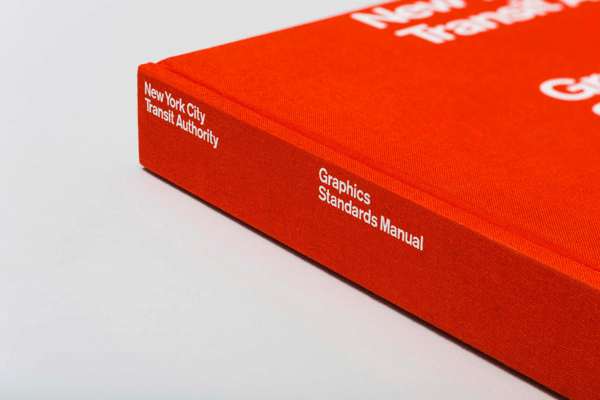
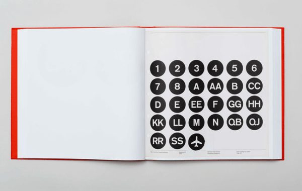
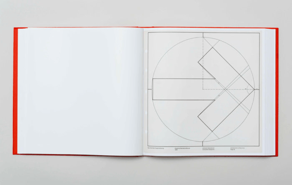
When it comes to services, few brands are more iconic than the NYC Transit Authority (NYCTA). Every subway, bus and ferry in The Big Apple adheres to these style standards, and it’s incredible to see them outlined in one book.
Strengths:
- Simplicity: There’s no confusing NYCTA’s icons with another system’s. Their visual language is reduced to absolute simplicity and speaks clearly to locals and distant travelers alike. Signs rarely deviate from their circular boundaries, typography is identical and even their arrows are thoughtfully constructed.
Takeaways
These style guides are beautiful examples of what you can develop when you really know your brand. There’s not a single random design decision made within these guides — every font, color and photograph help these companies stand out while remaining true to their purpose.
Thinking about creating or rebuilding your own brand style guide? Start with ‘why’ questions: Why should we use this font? Does it measure up to our value proposition and show users what makes us unique? Always maintain a clear path from your company goals to your design choices — your customers will hold your authenticity in high regard.
Nicholas Frigo
Nick is New Breed's Brand Manager. He drives our creative strategy and brand positioning across channels. When not in strategy mode, he's neck-deep in design and storytelling, crosswords and cooking.


