Your company is selling to end-users, so your website needs to speak to them, not just talk about yourself. So, as you’re developing or optimizing your website, it’s important to leverage design, content and user interface (UI) together to create the best experience for your site visitors.
While design, content and UI should be strong individually, ensuring those three elements work together is key to creating the best website possible for your users.
Here are five websites that exemplify excellent user experience design.
1. Stripe
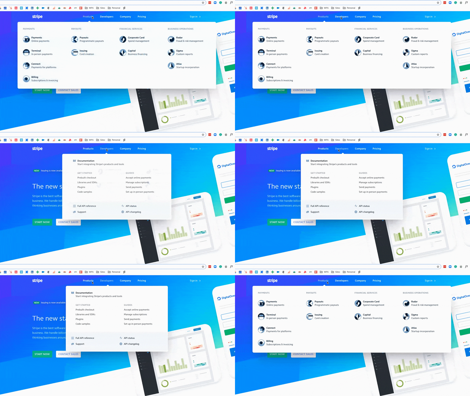
Stripe is the North Star when we think about user experience and web design. Their page design hits the nail on the head when it comes to leveraging design to drive a user’s eye toward specific content. Their webpages have a lot of space so it's easy to scan content, but they don’t feel empty due to the use of intriguing design elements.

What makes their website so unique are the micro-interactions that happen. When you move your mouse horizontally across the main navigation, the menu content slides in and out to match your behavior. When you hover over a button, it raises a couple of pixels to indicate it’s interactive. The gifs that introduce sections on their homepage help draw your eye down the page without being so busy that they distract from the content.
These small details keep the user engaged but aren’t so blatant that they cause visitors to focus on the design over the information they’re being presented.
2. Amilia
Amilia’s website does a great job speaking directly to their personas and helping users find relevant content immediately.
For example, each menu item in their navigation contains a one-sentence description of what the page will talk about. While their section labels are pretty straightforward, that additional sentence provides context so the user can really understand whether or not that section is relevant to them.
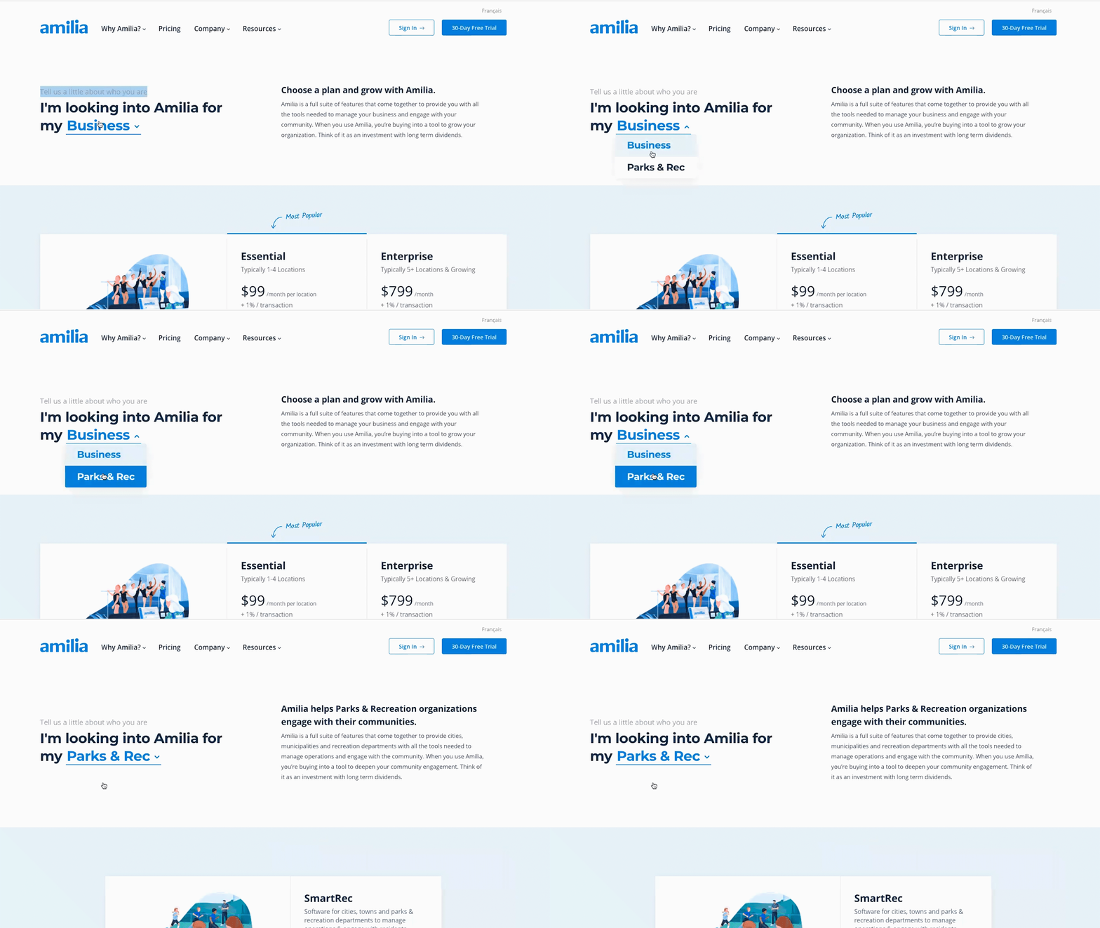
Amilia’s website also provides multiple opportunities for visitors to self-segment. Right above the fold on the homepage, for example, there are two paths a visitor can take: one for end-users looking to register for an activity through their platform and the other for businesses looking to leverage the platform.

A similar self-segmentation opportunity is available on the pricing page where prospects can select their type of company from a drop-down and see customized content based on their needs. While that drop-down does require an extra click, it ultimately improves their experience by serving them only relevant information.
3. Dynamic Yield
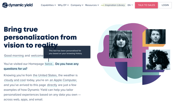
Dynamic Yield’s product is a personalization software, and they do a great job showing off its capabilities on their website.

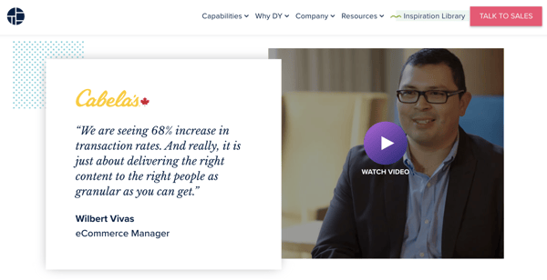
Another strength of Dynamic Yield’s website is their use of video content. They do a great job of pairing their videos with text. For all the strengths video has, it’s only effective if people actually watch it. So, to create the best user experience for all your site visitors, it’s best to pair videos with enough context for people who don’t want to watch them as illustrated by Dynamic Yield’s presentation of customer testimonials on their homepage.

4. Segment
One challenge B2B companies with complex products or solutions face is being able to articulate their offering simply and clearly. Segment overcomes this through their use of graphic elements.
Segment is a customer data platform that helps companies capture and leverage customer data. The visuals across their website help visitors visualize how their product works, illustrating the complexity of their solution without overwhelming users.
If a user is looking to buy something, price will be one of the most important factors. The objective of B2B websites is to help educate visitors, but ultimately it’s to generate sales. If you make it difficult to find pricing information, you’re doing your company a disservice. Even if your pricing is customized, you should have a place on your website that provides users with information about what factors contribute to pricing.
Segment not only makes their pricing page easy to find and clearly lays out the different versions of their platform, they also use visuals to illustrate the differences between their tiers, helping users better understand what version will be the right fit for their needs.
Segment’s blog also goes above and beyond to deliver a positive user experience.
Since the goal of most blogs is to attract visitors via organic search results, blog listing pages on B2B websites tend to be generic. Instead of sticking to the traditional blog listing layout consisting of clickable blog title cards, Segment has spent time organizing their posts by key user groups and makes it easier for users to access relevant blog content.
5. Nike
While Nike is B2C, they’re a great example of how information architecture can be done effectively when you have a lot of information to present.
Nike’s main navigation offers users numerous different ways to search for the content they’re seeking: they can navigate based on gender, new releases, sales, product lines, and more. With so many product options to choose from, it can be hard to summarize all the options in a way that all users will still be able to find what they’re looking for — and if someone doesn’t know what they’re looking for, they can still find something they like. Nike does that effectively.
Large B2B companies can create a similar user experience by considering all the different ways users might be looking for information on their website and presenting it in those different manners.
By providing categories, you’re enabling users to scan content more quickly and decide which menu item matches their needs.
Takeaway
User experience is a combination of design, content and user interface.
When you look at the design of these five sites, you’ll notice that they all leverage a lot of empty space and are intentional with their imagery. This allows them to use their design to draw visitors’ eyes down the page and toward the most important content.
A common trend in UI amongst these sites is the strength of their navigation in terms of both organization and content. Instead of just presenting listings, they use icons and subheads to provide additional context and help users find what they’re looking for more easily.
Finally, their content speaks plainly and is directed to users instead of centered around their company.


