There’s no questioning the value that a website can add to your business. Where there’s room for debate is whether you should prioritize only the user experience and intent over design. There is no hard and fast rule for whether or not your website should feature bold and creative visual design.
To some, a website should merely be a means to an end. A functional website should put user experience first, drive its visitors to the desired outcome and nothing more. Any creative or design-forward elements aren’t as valuable or could potentially detract from that ultimate goal.
However, there is a case to be made that compelling web design can craft a more memorable experience for your visitors and ultimately contribute to the value your website adds. Depending on your industry and competitors, a visually powerful website can be the differentiating factor in a prospect’s decision to buy from you.
With that in mind, I sat down with Chris Mathieu, New Breed’s Chief Design Officer, to talk about ways you can incorporate creative design into your website to craft a more memorable experience for your users without sacrificing user experience.
1. Experiment With Shapes and Colors
Perhaps the simplest way you can get creative in your web design is to home in on shapes and colors. Both have the unique ability to impact the appeal and memorability of your website to visitors.
“Color plays a big role in your underlying mood and impression,” says Chris. “You can use it to your advantage to create the experience you want your visitors to have.”
The same can be said for a lot of visual elements. PactSafe, a contract services platform, is a great example of the impact experimenting with color and shapes can have on a website. Their website features a bright, playful color palette, organic shapes and an intentional lack of symmetry.
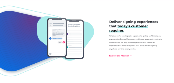
“These creative decisions provide a human element to a website talking about something very technical,” says Chris.
If purchases are made by humans, the more design work you can do to connect with visitors as people, the better. If you can create a human connection with people making software and technology purchases, you’re taking steps to set yourself apart from the rest of the crowd. How else can you do that?
2. Look Completely Different Than Your Competitors
A creative approach to take with your website is to simply flip the industry standard for design on its head. Exigent Group, a legal services and software company, made their goal to do just that.
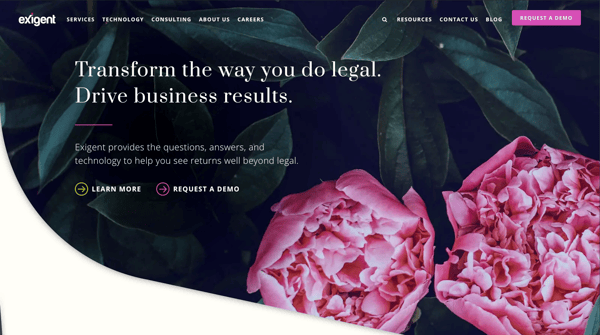
While most legal and corporate websites conform to a more traditional, uniform design style, Exigent embraced curves and alternative shapes to stand out in the marketplace.
“The website still functions like any other website,” says Chris. “Clear hierarchy, traditional navigation, a best practice user interface, but there is a ton of organic shapes that you don’t really see on the web in general – especially for a company that provides corporate law services.”
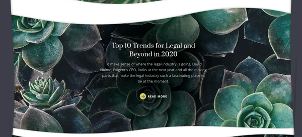
By leading with a website that functions the same but disrupts the visual standard for competitors in their industry, Exigent creates a lasting impression in the minds of their visitors. As prospects do their research, their brand is pushed to top-of-mind because of its unique design and aesthetic.
“As you’re doing your research on what platform to go with, ‘Oh yeah, the flower one’ is a very easy way to be different than all the rest,” Chris says.
3. Incorporate Storytelling
If a key sticking point for websites is that they should guide visitors to your ultimate goal, you can incorporate storytelling into your design to facilitate that journey. Buzzback, an organization that offers product research and development services, kicks off the customer journey with subtle, animated storytelling right on their homepage.
“As you go down the page, there’s more details about what they do,” says Chris. “But it sets an authentic and memorable tone right at the beginning.”
Buzzback provides the insight for why they do what they do and essentially establish a visitor’s reasoning for being on the site. If the best websites are designed to guide a visitor from pain point to solution, Buzzback starts that journey in a creative and memorable way.
4. Embrace The Little Things
Being creative in your web design doesn’t mean reinventing the wheel. In fact, subtle visual variety and soft touches can make vast improvements in the impact left by your website or the feelings had while on it.
Northpass, a learning software company, does just enough to provide visual diversity and stand out from competitors. Instead of just another stock photo, they incorporate depth into their hero with shapes wrapping around the photo’s subject, who wears a shade of green seen throughout their branding.
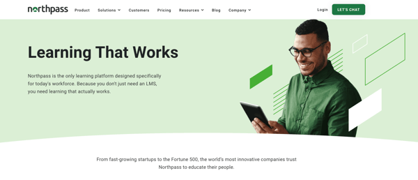
“It’s a traditional site, but by offering more creative treatment, it creates a more memorable experience,” says Chris. “Throughout the site, boxes slightly don’t line up and there’s added depth from simple vector shapes.”
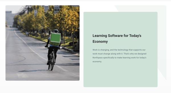
Despite its traditional navigation and experience, the Northpass website is anything but cookie-cutter. Like others on this list, they don’t deviate from best practices for user experience and interface. Instead, they provide small touches that offer visual diversity and add a human element to their technology-oriented product.
5. Align Your Design With Your Product
With that in mind, an excellent way to be creative on your website is to incorporate your product or solution right into your design. Allego is another learning platform that focuses on the use of video.
“Right off the bat they grab your attention with videos in the hero,” says Chris. “It’s a great choice because it ties the creative back into what they solve for.”
While video heroes are not unusual, Allego gets creative by using multiple small-form videos in the hero showing off their product in action. By incorporating their product into the design of their website, visitors are given an immediate preview of what working with Allego would be like and how it can solve for their pain point.
Brainstorming ways you can incorporate your product or solution into your website design can create a more meaningful connection between it and your customer early in their buying process. It’s a creative way to reinforce the ultimate goal of turning a visitor into a customer.
Takeaway
Getting creative with your website design does not mean foregoing user experience. Each of the websites featured in this list embraces standard best practices for interface, navigation, calls-to-action and more, but take a creative approach to their design to stand out in the crowd.
By incorporating any of these tips into your next redesign or website update, you can flex your creative design skills to create a more memorable experience for your visitors that can only support empowering users to take your desired action
Chris Singlemann
Chris is a Brand Marketer at New Breed where he is responsible for crafting design and video assets that support our brand. When he's not behind the camera, he enjoys kayaking and tending to his sourdough starter.


