6 Incredible Examples of B2B Web Design
We’re obsessed with web design here at New Breed and rightfully so. Design and development have drastically evolved over the past couple years leading to some unique modern design trends – and that makes our job a lot more fun. Today B2B sites are colorful and use advanced functionality to captivate and convert visitors into leads.
Not only that, but they create a narrative your prospects want to read and give the company life.
Now, I may not be a designer/developer, but I still love a well-designed website — and I love searching for them. Patrick, our CEO, suggested a site called Crayon. Crayon is the “most comprehensive marketing inspiration search engine.” So, of course, I spent an embarrassing amount of time checking it out and discovered some new (and old) B2B companies with incredible websites.
Let’s check them out!
1. Drift
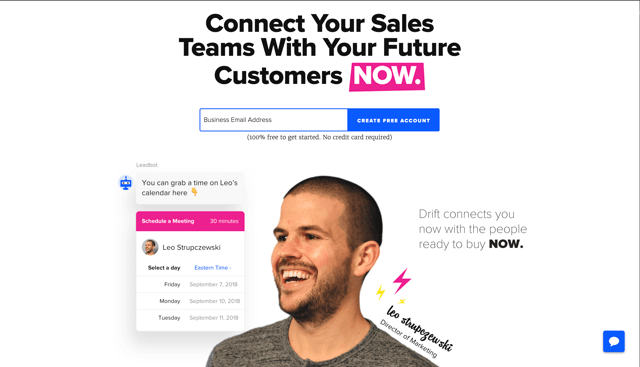
Why we love it: hyper personal
No cartoons or stock photography here. Drift dares to be different. They feature their employees and provide viewers insight into the people behind the company. This is a brilliant move. It allows the site to feel personal and build trust. Every page has a smiling face. Individuals and group photos are weaved seamlessly into the site's design. In the SaaS environment clean minimalistic designs reign supreme, but often lack personality. Drift manages to strike a balance between a clean style and a robust visual experience — proving you can be minimal and personal at the same time.
2. Quid
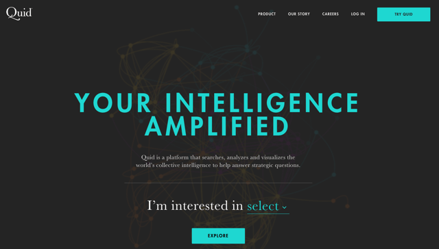
Why we love it: functional minimalism
In 2015, we saw a trend toward minimalism–in other words, using only the essential elements on-page. Minimalist design is particularly helpful in decreasing load time and increasing readability–in Quid's case, it also helps you scan through the site and still leave with an understanding of their product. Not only does a minimalist style help UX, but also adds sophistication. Quid doesn't clutter their pages and uses increased size and asymmetry to make small bits of content captivating.
3. Pulse 220
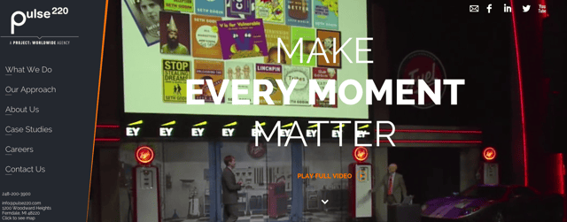
Why we love it: card layout
Popularized by the mobile movement, card layouts are a great way to concisely present content in an organized and user-friendly way. Pulse 220 uses the card layout a couple different ways: to present case studies and their team. I love card layouts because (for me) it's a prerequisite to display a minimum amount of information about what I'm clicking into in order for me to actually click. With card layouts, like Pulse 220's, you're presented with general, relevant information that helps you determine if you really want to continue reading (like topic tags for a case study or the role a person plays in the company).
4. Dstillery
Why we love it: long scrolling (to the next level)
It is a complete and total myth that users don't scroll and with mobile usage surpassing desktop, long-scrolling pages are one of the most popular design trends today. Long scrolling helps to increase the user experience on both desktop and mobile while giving the company a chance to tell their story. Dstillery takes long scrolling to the next level with fixed, long scrolling. That means, there are static elements on the page, but the main content changes as you scroll down, but the page never moves. It's revolutionary and changing product marketing.
5. publishthis
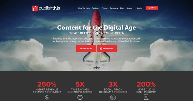
Why we love it: captivating imagery
The right imagery goes a long way. The full width visual of the sky with the space shuttle in the center is eye grabbing. While scrolling through a sea of thumbnails this visual pulled me in. The webpage design and imagery work perfectly, giving hierarchy to the background image to get the viewer's attention and allowing their eyes to begin exploring the page's content. Other publishthis pages follow a similar layout, including the pricing page, where the composition and allure of the space shuttle image is seen again with a picture of a woman walking down a dirt road.
6. Grammarly
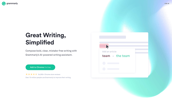
Why we love it: flat design
Now, we love the Grammarly site for a lot of reasons, some of which I've already discussed (long scrolling, functional minimalism, and animation). But the biggest reason is the use of flat design. Not just flat design, but design that fills up the entire screen. The laptop on their site uses flat design, which helps with load time and responsiveness for mobile devices.
The Takeaway
Alright, so I could go on and on showing the best B2B website design out there, but I know you've come across some great sites in your day. What sites do you love and what makes them so loveable? I'd love to hear (and see) about your aspirational websites — there are so many out there.
Happy designing!
The design elements of your website aren't the only aspect you should consider. Next, learn how to turn your website into an effective lead generation tool by integrating conversion optimization. What's conversion optimization? Download the e-book to find out:
This post was originally published January 21, 2016.
Olivia Perek-Clark
Olivia Perek-Clark is New Breed's Principal Solutions Architect, leading the charge on designing customized solutions within the HubSpot ecosystem. With over 10 years of experience using the HubSpot platform to drive measurable revenue success, Olivia has a passion for sharing her knowledge and insights on how to...


