SpringCM's Challenge
Our engagement with SpringCM started when they approached New Breed for help with conversion optimization and website design. Over the past two years, SpringCM and New Breed have fostered a collaborative relationship and continue to work together to this day to bring projects to completion.
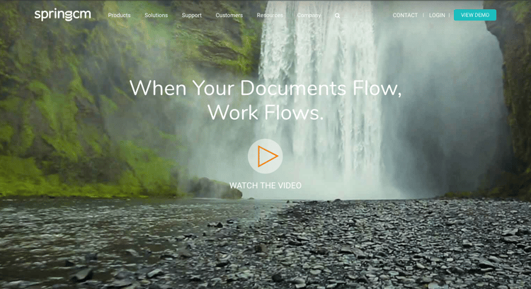
A year later, New Breed redesigned and relaunched SpringCM’s website with a “Work Flows” waterfall theme that Brooke Glynn, SpringCM’s Design and Brand Director, had been incorporating into SpringCM’s corporate branding in preparation for a Dreamforce conference. Just a year later, New Breed identified that the “Work Flows” themed homepage (while appealing to the eye) was suffering from extremely poor scroll rates. This was most likely due to a fullscreen background video section at the top of the page, discouraging visitors from proceeding below the fold because they were hyper-focused on the video that appeared to consume the entire page.
New Breed's Solution
Idea Generation
While we had a good idea of what caused the crippled scroll rates, we didn’t want to forgo the “Work Flows” theme altogether. Post-launch, the new “Work Flows” tagline was getting great traction with customers and employees in terms of messaging, visual representation and word-of-mouth. It was evident that the overarching concept was there, but the visual representation needed to be revisited.
Brooke recognized how much was on the horizon for SpringCM including expanded office space, new features of SpringCM’s solutions, new endeavors around reporting, analytics and AI and the fact that SpringCM would be on full display at Dreamforce, the Salesforce annual user conference.
Brooke’s idea of the “Work Flows” theme goes far beyond a clever branding strategy for their product — it’s a metaphor for her company as a whole. A waterfall never stops moving, and neither does SpringCM; the company was growing fast, elevating their product offering and getting smarter by the day. As her company continued to evolve, she realized that it was time to transition from being someone standing outside the waterfall to someone fully immersed within it.
Brooke’s goal for the project was to evolve their homepage design into something more modern and eye-catching, while somehow still incorporating the “Work Flows” theme in a more abstract way. During initial research, we were looking for ways to show the “Work Flows” theme in a unique way but without relying heavily on an actual waterfall. It wasn’t until we came across the MacOS background that we had the eureka moment. The Mac background conveyed fluidity, technology and vibrancy, coinciding perfectly with SpringCM’s vision.
Concept Development
After the discovery of the inspiration for the new “Work Flows” theme, the next step in the process was a creative call with New Breed’s seasoned web designers Zane Gunderson and Chris Mathieu. While the idea for the graphic was lofty, Zane and Chris, some of the most experienced developers on the HubSpot CMS, were ready to tackle the challenge.
During the initial creative workshop session, we discussed:
-
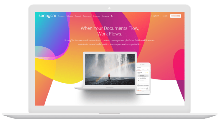
How to create vibrant layers that wouldn’t fill the whole page but rather would be floating throughout.
-
How each individual layer could scroll at a different rate to reinforce the layered movement theme.
-
How opacity could be used to create visual interest when each layer intersected.
-
How instead of having the video consume the entire screen, it could be presented within a short, small, autoplaying movie within the context of device frames.

Execution
Once the plan was established, a rough mockup of the idea was created and we walked through it on another collaborative call. From there, New Breed fine-tuned the design’s typography, layer positioning, icons and more to be fully optimized for the site’s content. Finally, New Breed developed the coded version of the graphic which included the opacity and parallax scroll rates to bring the original concept to life.
Before:

After:

Results and Impact
The new design managed to not only salvage Brooke’s waterfall metaphor, but also drastically improved scroll rates. Prior to the redesign, only 25 percent of SpringCM’s website visitors were scrolling below the fold and only 10 percent of visitors were making it to the bottom of the page. After implementing the new layer-driven design, that number jumped dramatically with 50 percent of all website visitors getting all the way to the bottom of the page.
To give you a more visual representation of the increase in scroll rates, below are images of the heatmaps for SpringCM's website before and after the implementation of the new graphic design.
Before:

After:

Another important result to note about SpringCM is the decrease in website load time. Typically, when working with a graphical homepage that has an extensive format, load time can be negatively affected. But despite this challenge, while working with SpringCM, we were still able to make the page load efficiently, receiving a score of 95 from Website Grader and a score of 83 from Google PageSpeed Insights.
The graphic design execution on SpringCM’s new homepage has lead to a rapid increase in engagement and has encouraged website visitors to expand their search when visiting the SpringCM website. The results from this project far exceeded expectations and go to show that sometimes a carefully executed design can deliver big results!


