EasyVista's challenge
EasyVista was working with several WordPress sites that had slow load times, were difficult to manage and desired a new design based on an updated brand. All of this combined to create a user experience that deterred visitors and made it difficult for EasyVista's team to generate leads. They were also supporting regional teams in North America, France, Spain, Portugal and Italy, which added a new level of complexity as they had websites translated into each native language. EasyVista needed a solution that could easily and quickly support five different websites in five different languages.
After dealing with these issues for three years, EasyVista decided it was time to re-launch a new website and enlisted the help of New Breed.
New Breed's process in motion
We began our engagement with EasyVista by developing a custom sales-ready website on the HubSpot CMS. This process began with the creation of EasyVista’s buyer personas and ended with a post-launch training session to ensure their team was empowered to manage their new online presence.
1. Buyer Persona Development
Buyer personas are semi-fictional representations of your ideal customers. They help you understand your prospective customers better and make it easier to tailor your content to their specific needs, behaviors and concerns. A successful sales-ready website must begin with this thorough planning stage in order to ensure the final product is geared toward a truly inbound, persona-based approach.
Prior to working with us, EasyVista was only targeting their content and website toward one buyer persona. At this step, we worked with them to develop two additional primary personas to guide their website redesign and content development strategy.
2. Information Architecture
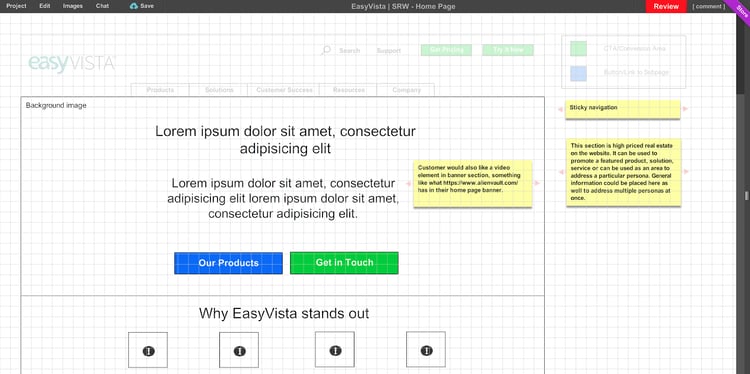
Once all of the planning documents were finalized, we then developed the information architecture of EasyVista’s new website. Information architecture encompasses the structure of a website. This allows everyone involved in the redesign process to understand the site as a user would and guides the placement of the information they would want. The end result is an understanding of the ideal user flow and digital buyer’s journey for each of EasyVista’s buyer personas. These understandings are built out into a sitemap, navigation bar, drop-down hierarchy, form strategy and website wireframes.

3. Design Prototypes
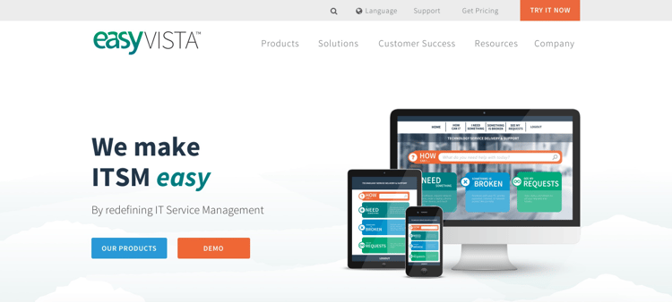
Building off the website wireframes, our team then worked in collaboration with EasyVista’s creative services team to develop a series of realistic mockups of the redesigned website. These mockups incorporate full messaging and conversion points to fully illustrate how EasyVista’s new website would both look and work. Each mockup was created with user experience in mind so that the website would better drive conversions and be truly “sales-ready.”

4. Content Development
With the design prototypes approved, we jumped into developing the remaining content the new website needed. Even the most beautifully designed website needs the support of well-written and powerful copy or conversions will still fall flat. Now that we had worked with EasyVista to finalize their visual and content styles, we could create copy with a consistent tone and style. Consistency of tone and style also elevates the user experience and furthers EasyVista’s value proposition:
"EasyVista is a next generation IT Service Management platform that empowers IT to meet the simplicity, agility and mobility demands of the modern digital workplace. They provide a modern platform that enables every employee to deliver engaging services, on any device, from anywhere."
5. Template Development
With all of the design and copy completed, our team coded EasyVista’s fully-responsive, custom HubSpot page templates. Upon completion of each template, a senior developer performed a rigorous QA test to ensure it would render perfectly for all screen sizes, browser sizes and device types. In addition, all of our custom templates are built with HubSpot’s native, visual Template Builder, so that EasyVista’s team can make variations of these templates without needing a developer.
6. Soft Launch
EasyVista’s soft launch production brought all of the finalized templates and their associated assets together to build out the entire site. Our team did a final round of QA and gave EasyVista full access in a staging domain, so their stakeholders could do a complete review as well.
7. Launch and Training
After a 4-month sprint, we ensured a seamless launch of EasyVista’s new website. Our team stood by with a post-launch QA to check that redirects and SSL were all working properly. Finally, we trained the members of EasyVista’s team on all aspects of their new site, so they could be internally empowered to manage everything on their own.

Results
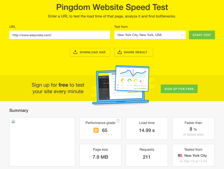
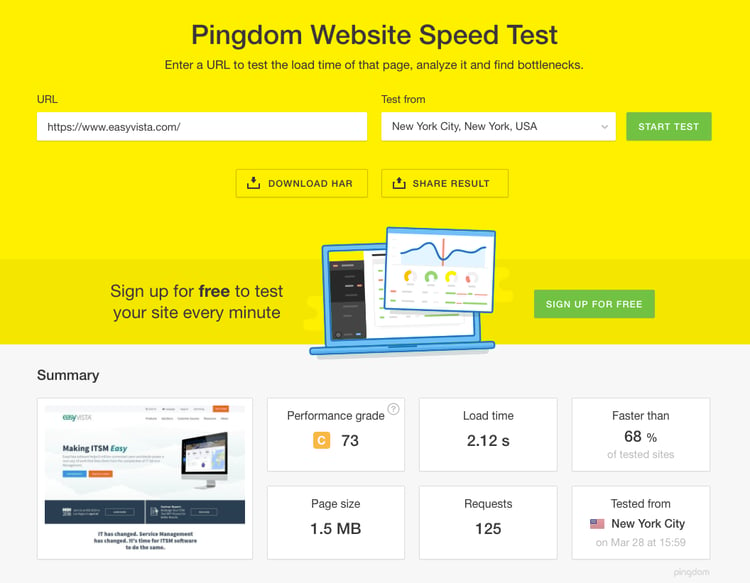
Since the website's launch, it's experienced some impressive results. As we mentioned earlier, their page load times have dramatically improved. The old website had a Google Analytics mobile performance rating of 28 and desktop performance rating of 11. The new website has a mobile performance rating of 89 (a 217% increase in mobile performance) and a desktop performance rating of 85 (a 672% increase in desktop performance). Their pingdom speed also decreased from 15 seconds down to two seconds, which is a 607% increase in speed. These new performance ratings and speeds contribute to a much better user experience as visitors are presented with the information they are looking for almost immediately.
Image1: Pingdom speed and performance before redesign;

Image2: Pingdom speed and performance after.

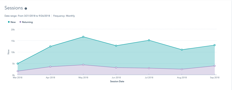
The new website also increased traffic by about 10,000 visitors upon initial release and has helped to generate higher levels of traffic than previously seen with the old website. EasyVista still hovers between 10-15K sessions each month.

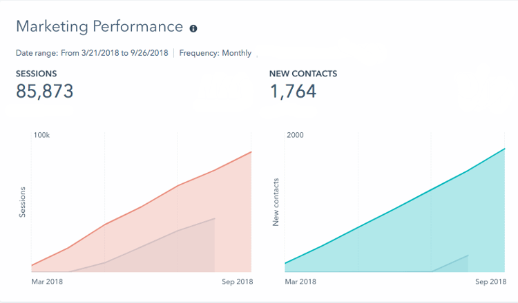
With an increase in website sessions, EasyVista’s new website has also assisted in generating more contacts for the company.

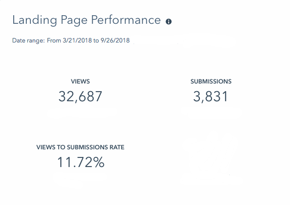
It's also increased their view-to-submissions rate.

It’s hard to believe that an incredibly slow website can hinder your lead generation efforts so drastically, but the difference between the old website and the new are night and day!
The Impact
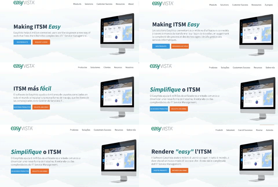
After the launch of their original website, our team has continued working with EasyVista to re-launch the entire site in five languages. Let me repeat that for you: we have built and rebuilt four more websites for EasyVista all on a single HubSpot CMS — and translated it into four additional languages. Our team built out the infrastructure for each translated site and then just had to slide in the translated content, thanks to the power of HubSpot's CMS. As an international company supporting regional offices around the world, it was incredibly important for them to have a site that could support each native language.

Their multilingual site features complete language translations and regionalized resource centers and blogs while maintaining a unified look and feel across each site. With one of the largest development teams in the HubSpot Partner ecosystem, our team was pushed above and beyond while launching each of these translations, but the end result of a satisfied client is well worth our efforts. Here is Gigi Walsh, Sr. Manager of Global Communications and Content speaking about this project:


