We've said before that Growth Driven Design (GDD) is about learning and adapting. But people learn all sorts of ways, and though we've told you to hypothesize, experiment and iterate, we've never gone into detail describing what that process looks like. Here's a brief (but thorough!) description of the process and results of a New Breed site GDD experiment, laid bare for the world to see. If you're ready, we are too.
A GDD Experiment Unpacked
Here's how it begins. We start by leveraging what we know.
Forming the Hypothesis
We looked at our sources report, found the metrics for our landing pages and thought about how other contact points with forms might be performing, like our "free consultation" page. It was important for us to start here, with a BOFU form, because part of the philosophy of our GDD program involves using a workshop to uncover high priority items. For us, a high priority item is to increase visit-to-lead conversion rates and bottom-of-the-funnel activity. We wanted to test low-hanging fruit first.
We noticed that when there's a new contact created or a bumped lead score for contacting us, it's very often happening through our contact page. Thinking about its high activity, we decided to try to boost form fills on the other contact point. We observed the heat maps in hotjar, but had a difficult time uncovering how much the form (vs. other page elements) impacted drop off. We also noticed that the free consultation page used our traditional design (time for an update!).
We formed the following goal and hypothesis, adding them to our experiment requirements doc:
Goal for Test
To determine the optimal page design for the Free Consultation page in order to increase the number of leads generated by this BOFU form who sign up for a free consultation with an inbound advisor.
Hypothesis Statement
For website visitors visiting the free assessment landing page, we believe restyling the page to match the contact page, which has a higher conversion rate will increase the visit to lead ratio by 25%.
We believe this to be true because the contact page has a higher submission rate (5.5%) and has historically been more assistive than the free consultation page with regard to number of contacts generated (2.7% of submissions on the contact page vs. 0.9% of submissions on the current free consultation landing page.)
Proving Ourselves Right or Wrong
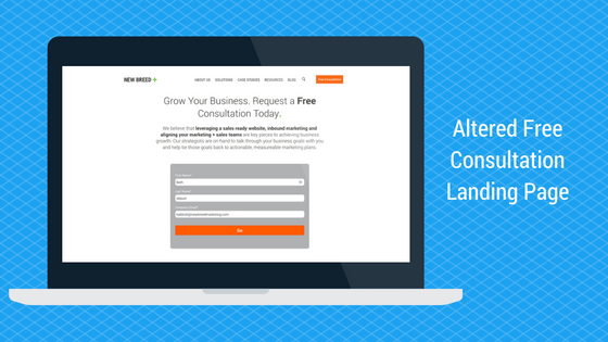
Next, we set up the experiment, altering the design (by tightening the copy and changing the form style):

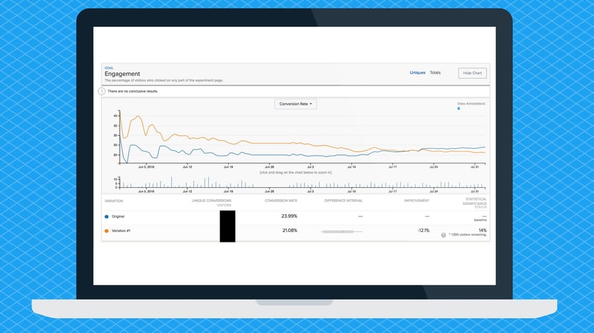
And we also set up our metrics and viewing in Optimizely to test the page conversion rate in tandem with the form completion rate. We then let the experiment run for a full 60 days. Why 60? A 30-day experiment is the absolute shortest we would run. But 60 days lets you see patterns begin to emerge. That's the shortest timeframe we'd use for an experiment, as anything 60 days and over is much more informative.
We had a lot of great data available in Optimizely, but also wanted to keep our own, experiment-focused data in a lab report sort of document. Here's what we saw in the first four weeks:
|
Timeframe |
HubSpot Form Submission Rate: |
HubSpot Form Submission Rate: |
|
Baseline |
6.72% |
N/A |
|
Week 1 |
8.7% |
9.86% |
|
Week 2 |
10% |
8% |
|
Week 3 |
7.69% |
7.69% |
|
Week 4 |
11.76% |
7.14% |
You can see above that our results aren't showing a discernible pattern. We saw an initial burst that later leveled off. And guess what we found after the full two months?

After 60 days, these competing pages started to produce dead even results.
Results Always Mean Learning
Our next step was to understand what we had learned. It's important to note that the purpose of GDD is to learn, not to prove yourself right. In fact, even when your hypothesis is invalidated, you might learn more than if it were validated! (That's science. We love it.)
We now knew there was no design-fueled difference in bottom of the funnel visit-to-lead conversion rates on these pages. We could see that if a person had made it to the bottom of the funnel on these pages, they'd contact us regardless of design. (Unless we made it really difficult. Never do that!) But we also learned that we couldn't just say "design doesn't make a difference!" and move forward with a copy test. Instead we needed to try something else.
"There isn't a silver bullet for visitor-to-lead conversion ratio," explains Spencer March, who runs New Breed's GDD program. "There are lots of things that get people to their conversion points and there are lots of ways for them to interact with those points in the context of their buyer behaviors. So we need to look at everything that could be a contributing factor."
March advises doing the same if you're running your own experiment.
"When you're setting up tests and putting together your test design, really take the time to go through every factor that could influence your target metric. Understand that your test involves all of those factors, and that you might not end up testing exactly what you intended to test. Don't test those factors at the same time. But understand them alongside the factor you are testing now."
In keeping with this attitude, we didn't given up on improving our landing pages. We wanted to try another landing page variant for a couple of premium content offers. Testing variants will eventually lead us to a data-backed template design we can share with our clients.
"GDD is a process of continuous improvement," says March. "One lesson I learned here was about this particular BOFU form design's impact or lack of impact on conversions. But the other lesson would be that we can’t say that a landing page design that works on your site in one place will work in another place, with a different content idea or funnel placement.
"You see case studies and it’s easy to get jazzed up about these compelling changes and the success you've achieved," March says, "but it’s really more contextual than that. You can’t just take blanket statements. Context is defined by journey stage and by the user’s information needs. You need context to adapt and hone your experiments."
Karin Krisher
Karin is Content Lead at New Breed. She specializes in developing content strategy and copy at every point in the creation process, from persona design to final edits


