4 Things Your Website is Missing: Inbound Web Design Best Practices
When it comes to B2B marketing, your website should always be your number one salesperson. Usability and conversion optimization can make or break your inbound marketing efforts. Make sure you adhere to these four best practices when it comes to inbound web design and development. The following examples are taken from websites designed and optimized by New Breed.
1. Optimized Navigation

Optimized navigation is a critical element of any website. Visitors need to be able to easily access content and useful information. Three components that make up a good navigation bar are self-segmentation options, “stickiness,” and a visual CTA.
Giving users the option to self-segment across your solutions by industry, role or challenge makes life easier for both you and the visitor. By giving the visitor the option to create filters and minimize irrelevant information, your site can better serve helpful content to the user. Best of all, you don’t even have to try to classify the new lead’s buyer persona — they’re basically doing it themselves. When a user submits a form on a page segmented by industry, role or challenge, your site can autofill that form to streamline the process and promote conversion.
Because navigation dictates the actions of the user and provides useful guidance, it gets quite a bit of attention, so it’s important to capitalize on that exposure. Promote conversion by placing a visual CTA in your navigation bar. Placing a large button with an actionable phrase like “Start Your Free Trial” or “Request Consultation” will be a constant reminder to the user that there is an opportunity to receive an offer. Giving the user a chance to convert every time they consult the navigation is a proven tactic for driving conversion.
Like the name suggests, a sticky navigation bar is a navigation bar that “sticks” to the top of the window and follows the visitor down the page as they scroll past the fold. This makes it possible for the user to see essential conversion links and a CTA no matter where they are on the site. It also reduces the chance of a visitor getting lost on a page or missing an opportunity to convert. When you put that CTA in the sticky navigation bar, too, visitors will always have the opportunity to become a lead, no matter where they are on the site.
2. Social Proof

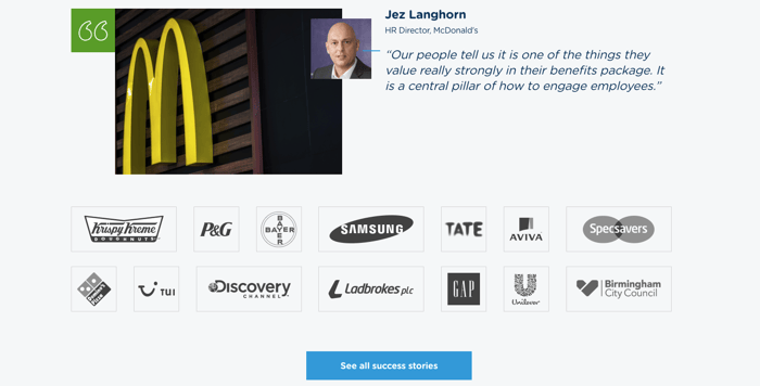
As any B2B marketer knows, the B2B buyer's journey is a long and thoughtful process. B2B consumers are understandably cautious when making purchasing decisions; they're making costly investments that affect their entire company — and that's why having social proof on your website is so important.
Obviously, no brand is going to publicly say anything bad about itself, so when a brand talks about how great it is or what types of benefits it can provide, it often gets taken with a grain of salt. However, when outside organizations promote that brand, it can produce a significant impact. By forming brand associations with respected thought-leaders in a given industry, it's possible to garner brand authority and urge cautious B2B consumers down the funnel.
Social proof is basically "proof" of your reputation or status in your industry. Social proof can take the form of testimonials, influencer and co-marketing tactics, or earned media mentions. By featuring social proof on your website, you can reassure unfamiliar visitors that your brand can be trusted, thus promoting lead generation.
3. Resource Library
Resource libraries are essential to any inbound marketing strategy. If you’re doing inbound right, it’s likely you have more content offers than you can count. Organize them in a segmented resource library for easy accessibility. Segment your content based on the type of resource and the essential aspects of your B2B buyer personas: pain points, goals, industry and role. Classifying your resources by these different details will make life easier for both you and the visitor.
Instead of having to search through your site for the right piece of content, the visitor can just hop into the resource library and look through selections that are relevant to their interests or problems and their stage in the buyer's journey. In turn, you have visitors who are choosing to look at pieces of content that they are more likely to convert on. By providing a comprehensive selection of helpful, educational resources for every stage of the buyer’s journey, you can attract, convert and delight your visitors.
4. Optimized Landing and Thank You Pages
Landing Page

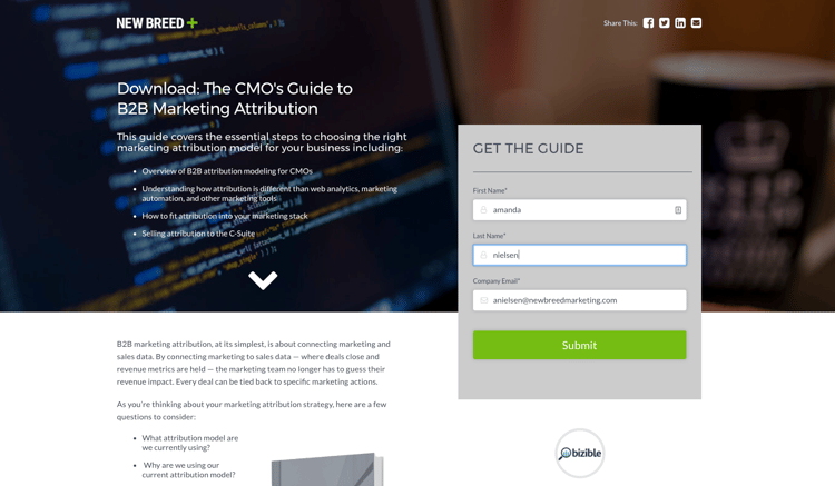
Landing pages are what make or break your conversion rate, so inbound best practices are especially important to include in this part of your web design strategy. First and foremost, you need to make sure your landing page has no navigation bar or footer. Including these elements can potentially distract the user from submitting the form, tanking your conversion rate.
Always make sure your form is "above the fold." This means that the form must be clearly visible to the user without having to scroll down on the page. If the user cannot obviously see the form, they may navigate away from the page without realizing they missed it. The main goal of a landing page is to get the user to submit a form and become a lead, so this tactic is particularly important to your conversion rate. As for your form strategy, always make sure your landing page is coordinated with the appropriate form.
Next, you must make sure your copy is detailed and actionable. A headline like "Download: The CMO's Guide to B2B Marketing Attribution" is clear and concise. The word "download" acts as a verbal call-to-action, further promoting your conversion rate. Your headline should be short, but detailed enough to stand alone. It needs to clearly and accurately communicate the value proposition of the content offer.
Subheaders and descriptions are where you can go into more detail. These sections of your landing page should still be clear and concise. Ideally, your copy should be as short as possible while still providing necessary detail. Because the landing page is a crucial part of the conversion process, you don't want to overwhelm the user with thick blocks of text. Bullets and lists are useful for presenting the value proposition of the content in a clear, organized way. Including a singular visual element like a photo or video can promote conversion, as long as it is engaging and relevant to the content.
Thank You Page

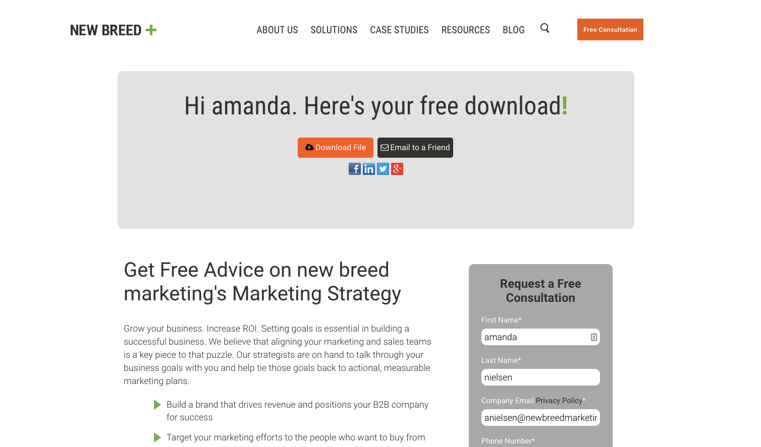
Once your new lead has submitted the form on your landing page, they will be taken to a separate page, called a thank you page, to access their offer. The content offer should be directly accessible from the thank you page to promote further engagement on your site. Providing a direct link to download the content is the best way to keep your new lead on your site.
A common mistake many B2B marketers make is only emailing the content offer rather than providing a download directly from the website. By providing the content only via email, your new lead will be forced away from your site, lowering the chances of them further interacting with your site content. Even worse, once they are looking at their email inbox, they can potentially get distracted from your content altogether. Instead, you should provide both an email and a thank you page, both which take them to their download, and both which include a follow-up piece of content.
Keeping the new lead on your site allows you the opportunity to provide more content for them to convert on, sooner. Use a CTA or a form for a content offer that corresponds to the next stage in the buyer's journey to push this lead down the funnel and promote your conversion rate. For example, if your new lead has just submitted a form for a top of funnel content offer, it makes sense to provide them with a CTA to a landing page for a relevant, middle of the funnel piece of content. Or, you can just place that form on the thank you page, as shown in the image above. Ideally, you want your second content offer to complement their first content offer.
Make sure to utilize HubSpot's Smart Content feature in your form strategy. Once your lead fills out their first form on the landing page, the second form they reach will autofill with the information from their first submission. By using Smart Content to make the process a bit less cumbersome, your new lead will be all the more likely to submit on another form, pushing them further down the funnel.


