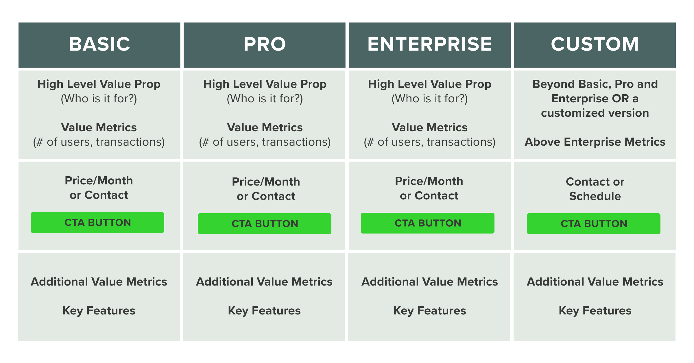
When a website visitor navigates to your pricing page, they have high-buying intent. If someone is seeking out pricing information, they’re almost always seriously considering your solution and comparing your cost to their budget or to what your competitors charge.
Those visitors have navigated through so much of the buyer’s journey already that it’s important not to create undue friction. In today’s buyer-centric environment people are more empowered to make decisions on their own, and it’s important to enable them to do so by providing your pricing information.
Here are five best practices to follow when designing your pricing page:
1. Make It Clear What Your Pricing is Built Around
Your pricing model should be built around your offering’s value metric, which is how you quantify the core value your product or service provides. Essentially, your value metric is what users are paying for, and it should be what differentiates your different pricing tiers.
For example, the value metric for a CRM is typically the number of contacts. For a support software, it might be the number of seats. For a copyediting service, it would be the number of hours your project requires.
When a user views your pricing page, it needs to be clear what your value metric is.
Wistia’s pricing page does this effectively. Their value metric is the number of videos users can embed. When you at their pricing page, that feature is the first thing listed that differentiates their product tiers.
2. Use a Simple Design That’s Easy to Understand
Your pricing should be relatively easy to understand and prominently displayed on your pricing page. Don’t make visitors scroll endlessly before they can find your pricing details.
Additionally, make sure your different options are clearly laid out and use a table or bullet points to format your product details so the amount of information won’t overwhelm readers.
Finally, try to keep the number of options you present to a minimum. Most products shouldn’t have more than four tiers. The more you add, the more complexity you add to your pricing and the harder it will be for buyers to determine which plan is best for them.
If your pricing is so complex that prospects won’t be able to understand what they’d pay by viewing a pricing page, then it might be appropriate to use your pricing page as a way prospects can contact sales to get a quote instead. But, before choosing to do that, take a look at what pricing information your competitors display. If everyone but you has pricing information publicly available, prospects who are shopping around might stop considering your company for that reason alone.
Jira’s pricing page exemplifies making it easy for a visitor to understand. The large font size makes the actual price for each tier stand out and the rest of their tier details are cleanly presented in a table. Additionally, visitors can enter how many users they’ll have in the response box at the top of the page and the prices will adjust accordingly.
3. Align Your Pricing with Your Personas and ICPs
Your pricing options should be based around your personas and ICPs.
For example, if different-sized businesses need different functionality from your product or service, your tiers could be aligned with the sizes of your ICPs. Alternatively, if your buyer persona’s role impacts how they use your offering, you could also establish plans based on their individual needs.
Expensify does a great job of calling out which of their personas and ICPs each plan is for and highlighting the specific features that’ll address their pain points.
4. Enable Users to Quickly Get in Touch with Sales
If someone on your pricing page has a question or wants to take the next step and reach, it should be easy for them to contact you.
There are a number of ways you can enable them to do so. You can list your phone number on the page so they can call your sales team directly. You could place links to forms that enable them to book a meeting. Or, you could use a chatbot that lets them get answers in real-time.
Sprout Social includes a phone number in their website header. On top of that, if visitors on their pricing page want to get in touch instead of starting a free trial, they can click “request a demo” and fill out a form to reach the sales team.
5. Provide Additional Context with FAQs
Are there common points of confusion regarding your offering’s features or what the purchase process looks like? If so, you can save your sales team’s time by placing FAQs right on your pricing page.
It’s good to cover what your value metric and various features are, how your billing process works and what people can expect after they close as customers.
HubSpot goes above and beyond when it comes to providing additional context on their pricing page. They have a chatbot pop up to provide assistance, FAQs further down the page and a hover state explaining each feature their product has.
The Takeaway
At the core of your pricing page is your pricing model.
If you don’t have your pricing model determined ahead of time, you’re going to have trouble conveying it clearly which will damage user experience and could hurt your sales.
On top of that, keep in mind that the purpose of any website page is to present content. Instead of shoehorning your pricing information into an existing template, design the page around your pricing information so that you can ensure visitors can quickly and easily find what they’re looking for.
Guido Bartolacci
Guido is Head of Product and Growth Strategy for New Breed. He specializes in running in-depth demand generation programs internally while assisting account managers in running them for our clients.


